the top 5 things that DON’T belong in your digital ad

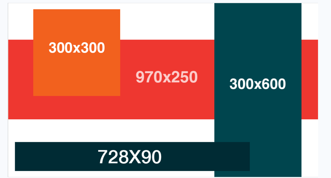
Some digital ads have less space than people realize. Ad specs for display platforms can be wicked small, from just 300 x 50px to 300 x 600px. While social specs sport bigger sizes in the realm of 1080 x 1080 px, in the grand scheme of things these ads usually aren’t any larger than your average slice of cheese when viewed on a mobile device. Check out some rough ad dimensions here:
We’ve written in the past about best practices for ad creative and what to expect across a variety of platforms for digital ad specs. With such limited space, knowing what SHOULD NOT be in your ads is nearly as important as what should be. We love a good “top things” list, so here are the top 5 things that you don’t need in your digital ads.
1. contact info
We know hearing that you should keep your contact information off of an ad probably feels counterintuitive. You might be thinking, “Uhhh, cohort.crew, how are they going to reach out to me if I don’t give them my contact info?” The answer is – you will be! Let’s compare the format of more traditional ads and digital ads.
On a print ad or TV commercial, your prospective customer often sees your ad in a location where they can’t immediately take action. You’re hoping that they’ll save the ad or remember the phone number, address, website, or email through repeated exposure and get in touch.
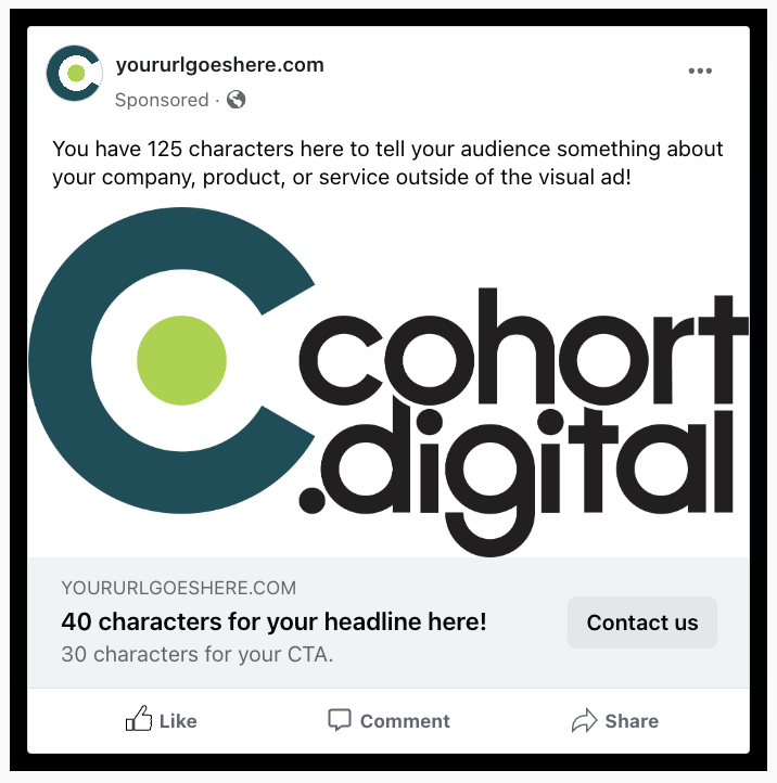
Digital ads are served on devices where your audience is no more than 1-2 clicks away from taking action, and sometimes directly reaching out to you. Your contact details are in or around the ad, they’re just available in the form of clickable links or buttons. In most cases, clicking on the ad takes them to your website or a dedicated landing page where they can find all of that information. Additionally, with some social platforms you can add text alongside the ad and program out buttons that link directly to your website or a click-to-call phone number. Check out a facebook ad mock-up as an example:
2. QR codes
The purpose of a QR code is to get in front of people in an in-person setting and drive them to view information online. Think of common uses you might have seen for QR codes recently. Exhibits at art galleries post QR codes next to the display, when you scan you’re linked to more information on how to purchase from or support that artist. Restaurants leave table tents with QR codes on tables, allowing them to save printing costs and make menu updates on a regular basis. Coinbase’s screensaver Super Bowl commercial wanted to prove the power of QR codes could drive so much traffic their website would crash. (just kidding!)
The commonality of these uses for QR codes is that they’re trying to drive users from analog to digital environments. When we’re talking digital ads, most of the time the user is going to see your ad on a desktop or mobile device. If your prospect is served an ad containing a QR code on their phone, they often don’t have another device to scan the code with. Since they’re already in a digital space, it makes the most sense to fill your ad with content they’re likely to resonate with in the hopes of driving that click or tap.
3. too much information
We don’t mean TMI as in oversharing. We mean too much information as in literally filling up the ad space with more information than the eye can comfortably take in. Much like the instinct to include all of your contact information, it’s normal to want to fit as much general information as possible into every impression. In the case of digital ads, less is more. When ads contain too much information, the user’s eye becomes overwhelmed, visually tunes out, and ultimately passes it by. What’s more, with such limited ad space including too much can render the content illegible. Instead, we recommend really getting to the bottom of the most important thing you’re trying to communicate. The old billboard adage to use seven words or less fits neatly here. If you can draw the user in, they’re just one click away from your landing page or video where they expect to take in more of the information you want to get across.
4. the unexpected
Expecting the unexpected can be delightful in the right context. In your ad content, we definitely recommend delivering what’s expected. What we mean by that is making sure the content they see in the ad is consistent with what they’ll find if they click on a link or click to call. For example, if your ad suggests they can shop at your online dress store, when they click the link it should take them to your e-commerce portal where they can browse dresses. Your ad lined up with the experience you promised = win.
When your ad path takes the user to something other than what the ad indicates, it can leave consumers with a bad taste in their mouth. This can happen intentionally or unintentionally. Obviously it’s a swing and a miss to use an ad that promotes a free item, but takes the customer to a product with an unexpectedly high price tag. More subtly, it can also be harmful for an ad to suggest they can find more information when a link click takes them to a landing page without any available resources. This concept remains true visually, as well. Your ad color palette and design approach should be similar in nature to your landing page. If there’s a great visual disconnect, visitors will wonder if they’ve actually gone to the right place. Whatever the case may be, it’s key to make sure where they land delivers what was promised.
5. compliance concerns
This one is often industry specific. If you’re in credit and lending or deal with social issues, you’re likely no stranger to the imagery or wording that might get your ad flagged. First and foremost, know your industry regulations about things like disclosures, logo requirements, promissory language, and the like. Know what verbiage and punctuation are safe to use and what will automatically flag your ads for additional review. It can also be a huge space saver to understand if your paragraph of disclaimers really needs to be in fine print at the bottom of your ad, or if it can be moved over to your landing page instead.
Outside of your unique situation, some ad platforms are on high alert for imagery or text that is defamatory, promotes violence, misinformation, or touches on sensitive issues. Sometimes there’s a fine line between a compelling ad that might drive clicks, and content with the potential to get your ad shut down.
conclusion
Our hope in providing this information is that it takes a load off! It’s only natural to want to provide as much information as possible to your prospects. In some forms of media you must include more information in order to make sure people find you. When clients are just a click away from your website, you can save your ad real estate to really capture your audience’s attention.